
Toby breaks down the details on the picture enhancement he provided for the critically acclaimed BBC/AMC series…
I worked closely with Director Lucy Forbes and DOP Benedict Spence in creating the look for ‘This Is Going to Hurt’. We met early on in pre-production to discuss what look was right for the show, long before the final grade. We established the following key components for the look;
-It has to look ‘authentic’
-It has to be filmic/cinematic
-It has to have a slightly broken or degraded quality to reflect the NHS, but still be beautiful (also like the NHS)
-It shouldn’t feel contemporary, but it also shouldn’t feel dated. It needs to be timeless.
Benedict and I then discussed how best to optimise the capture for the show to make sure we had everything we needed for the end look to work. As there was going to be a lot of practicals in shot (fluorescent tubes / operating studio lights / tableside lamps etc) we needed to maximise the dynamic range captured and prioritise the highlights. Benedict decided to shoot 2000 ISO on the Alexa LF to shift the mid grey point down and give us more highlight latitude than shadow latitude, which would also lend itself to a more filmic look and provide some natural texture to the image. The collaboration between Benedict and myself at this stage was pivotal to the final look.
Benedict shot screen tests ahead of the shoot, which were on location, in costume and with Ben Wishaw. These were extremely helpful in developing the look as we could experiment with the grade and start to show the other creatives and producers what we were talking about. This allowed us to accurately refine the look as needed before making a show LUT to be used on set and for the dailies. It was hugely beneficial to have material for this experimentation that represented what would be shot and let us create something bespoke for the scene colours and lighting of the show.
The show LUT was approved by the other creatives and producers and it was immensely helpful to have this consistent vision throughout the shoot and offline.
Below I break down the key components and how I tried to achieve them with my work on the show;
Authenticity
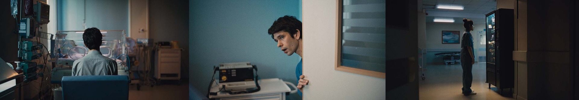
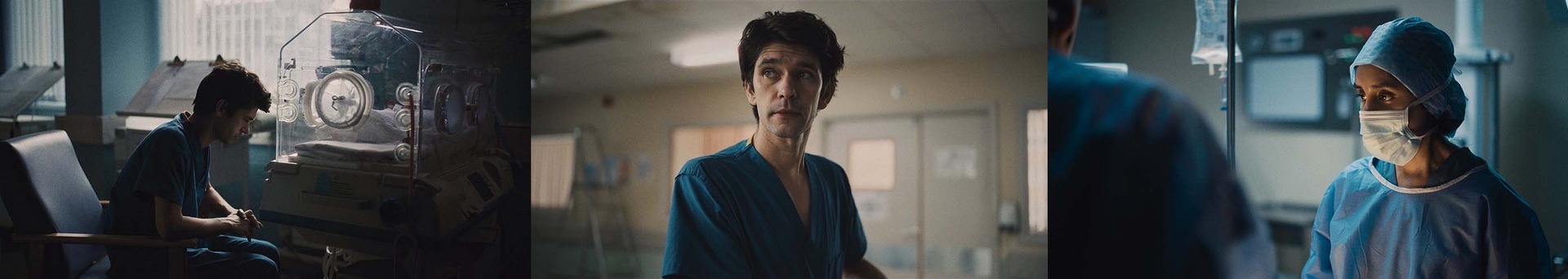
Lucy and Benedict decided to shoot the show hand-held and follow Ben as closely as possible, so there was an inherent truth to the feel of the cinematography already. From a grade perspective I wanted to make sure we rolled with the lighting changes as we travel through very different rooms and lighting.
Benedict used a whole range of lighting temperatures and tints with his lighting, so I was conscious not to ‘correct’ too much of this out. This gave us something that felt authentic and honest within the overall ‘look of the show’. I think it’s this variety and staying true to each scene that gives us that filmic authenticity. Everything was in the same ‘world’ but the variety in each scene could still shine through.
We also tried not to make everything look too pretty, this was the NHS after all and we wanted to show the gritty beauty of that rather than an overly polished interpretation.
Filmic/Cinematic
I hate using these words as they are so inherently ambiguous and subjective, but for me they sum up a whole range of qualities that Lucy and Benedict (and me) like.
Tone
The tone of the look was inspired by print film, which has a lot of shadow density that adds a beautiful amount of contrast to the mid-tones, normally where the actors sit in the tone scale. This really helps give the faces depth and helps increase the colour separation in the this range as well, so we got really nice separation between the characters and the background with a beautiful amount of depth in the image. A full print emulation was going to be too strong for this show as the lighting couldn’t be controlled as such given the shooting style, so I recovered some extra shadow detail and softened the shadow fall-off to give us some more safety in the shadows, while trying to keep the filmic contrast in the mid-tones. I also slightly lifted to black point to give it a slight fade. This gave us the kind of soft contrast in the shadows you would experience in the cinema with projection when watching it on a TV.
Colour
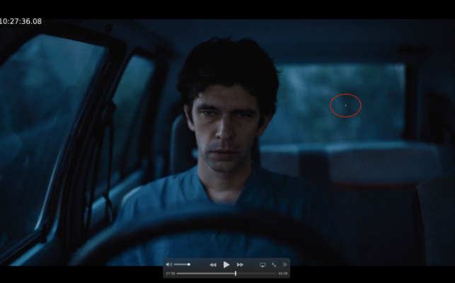
Beyond the tone we also wanted to skew the colours into a more filmic palette, which adds a lot of separation between warm and cool tones and dulls some other colours. This really helped with the blue tones in the NHS and the costumes while also exaggerating skin tone, giving everything a more timeless palette that has been established through cinematic history. I used some proprietary film negative emulation for this that I developed myself by shooting 1000’s of colour patches on both digital and film and creating LUTs that emulate how film sees colour, giving us a log starting point similar to that of negative stock scans but without the tone of negative stock so we could dial that in ourselves to taste.
Here is an example of two of those colours that I compared (out of 1000’s), showing how the Alexa captures red and green vs Kodak 50D;

Here is the full unprocessed data set that I used to generate the negative emulation;

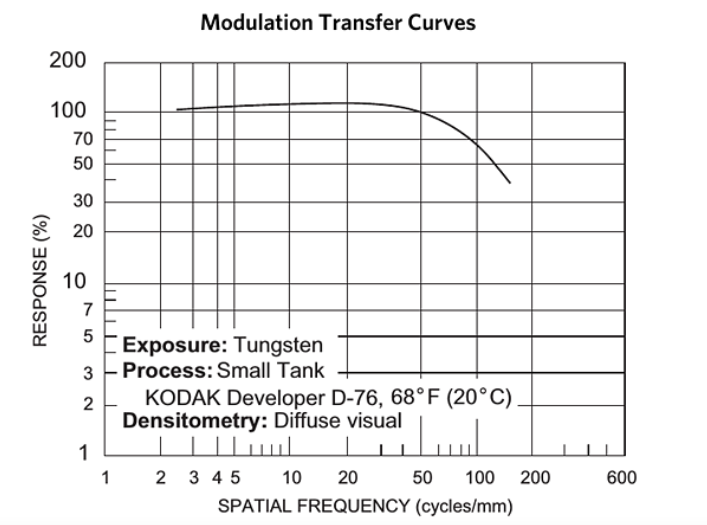
Texture
When people think of film texture the focus is often on grain (more on that later!), but there is much more to film’s rendition of detail and texture than just the grain. Film has its own ‘MTF’ (Modular Transfer Function) response, which means different frequencies (sizes of detail) have different levels of sharpness. The below chart demonstrates the different response of contrast/sharpness through the frequency range of film;
I worked with a colour scientist and programmer to develop a plugin for DaVinci Resolve that lets me adjust the MTF of digital material, like an ‘equaliser’ for different frequencies and contrast. We called it the Cheat Frequency Equaliser. I used this proprietary plugin on ‘This Is Going To Hurt’ to both better emulate the texture of film, but also to enhance the pores and wrinkles of the cast to exaggerate their ‘tiredness’ and stress their humanity.
Another thing we loved about the film references we had was the softness of the highlights. Benedict would normally use a diffusion filter to achieve this but together we decided to do most of this in the grade so we could have more control and not affect the textures of the skin and textures of the sets. I used a luma qualifier to select the highlights and create a soft glow / halo and make the highlights roll-off into a softer texture.
Degradation / ‘Broken NHS’
Grain
We really wanted to have an element of the look that gave the show some ‘grit’ that highlighted the less glamourous side of the NHS.
We wanted to use film grain to help achieve this, but had warnings from engineers at the BBC about the effect of broadcast and iPlayer compression on grain. Fortunately we had help from the BBC’s ‘Technical Subject Matter Expert – Television Production and Delivery’ who let us send multiple test sequences with varying grain size and intensity. This is the first time a production has tested grain in this way.
The BBC engineers then encoded our test sequences to various broadcast and iPlayer streams so we could evaluate for ourselves, using material from the show. We found a sweet spot where we could feel the grain, but not notice too many artefacts. We had to push the grain a little stronger to make sure it survived the compression and use just the right size of grain. We then dialled different amounts of grain into the shadows, mid-tones and highlights after we realised where there was the most/least compression. It was by far the most involved process I have ever undertaken when it comes to setting grain level on a show.
We also wanted to add the occasional bit of ‘dust’ to the show, a bit like uncleaned film scans. We never thought the broadcasters would agree but we were delighted when they said we could. We experimented with different amounts to try and find an amount that was occasional enough to not be distracting or look like a mistake. The generator I used for this couldn’t get the frequency quite right with the settings so I used a checkerboard alpha input to reduce the regions they would appear in and therefore fine tune the frequency.
Example;
Remjet Removal / Halation Emulation
Modern film stocks employ an additional layer called the ‘remjet’ layer. This layer reduces ‘halation’, the effect of light scattering/bouncing off the back of the film if it makes it all the way through the other layers. As the light of these bright areas scatter back up through the film they re-expose the film layers above, first the red, then green and then blue. This gives bright highlights a red/orange ‘glow’ around the highlight.
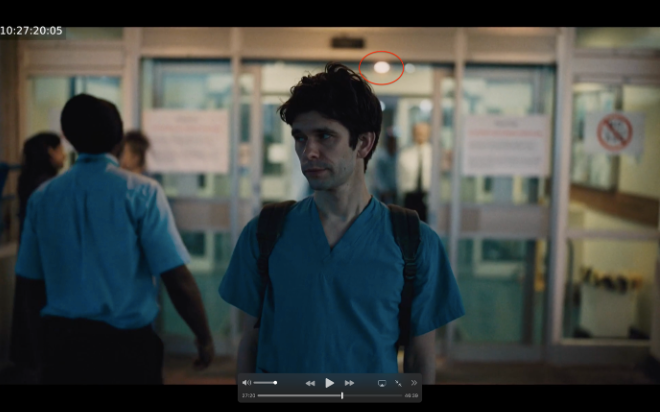
Benedict really liked this effect, which was present in some of his references. I created an emulation for this effect that gave us a similar effect to older film stocks, or film that has had the ramjet layer removed (like ‘Cinestill’). To create the effect I converted to log image to linear to get more fidelity in my luma key and applied varying blurs to each channel (RGB). This was another reason why Benedict didn’t use a lot of filtration on capture, so that we could preserve the fidelity of the highlights and isolate the halation to just the very brightest parts of the image / specular highlights.
Timeless
I’d like to think we achieved something that felt timeless by combining all the elements above in the right way. During the final grade I was conscious to keep my grading to a minimum and preserve the authentic of the photography, emulating a more photochemical finish. It required a lot of discipline and at times we had to depart that approach to reshape the image to help the narrative. Hopefully no one can notice those moments!
Other information:
-We had 3 days to grade each 45m episode
-We graded on DaVinci Resolve Studio
-It was an SDR HD finish

