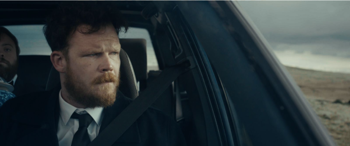
‘An Irish Goodbye’ is a black comedy following the reunion of estranged brothers Turlough and Lorcan following the untimely death of their mother.
Last month it was announced that ‘An Irish Goodbye’ was nominated for a BAFTA and an Academy Award.
Ahead of the BAFTA ceremony on 19th Feb and the Oscar ceremony in March, we spoke to writer/directors Tom Berkeley and Ross White, and colourist Jonny Tully, about how ‘An Irish Goodbye’ came together, what it was like working together on a second BAFTA nominated film, and how the story influenced the look.
CHEAT: First off, you previously worked with Jonny on ‘Roy’ - the 2021 BAFTA longlisted short film. Why did you come back to Jonny for ‘An Irish Goodbye’? And what kinds of skills or traits do you look for in a colourist?
TOM & ROSS: Jonny’s long and varied CV speaks for itself, but it was actually his openness and passion for each project that really drew us to collaborate. On a short film in particular we are always looking for the perfect blend of expertise and enthusiasm for the work - because you’re working on a shoestring budget, having one without the other isn’t really an option.
Though we have worked with Jonny twice now, we are bizarrely still yet to meet in person! Such was the madness of going through post during a pandemic (twice!), all of our collaborations were remote, but Jonny facilitated this with ease and openness, allowing us to ask questions and learn about his process as debut filmmakers on ROY.
CHEAT: When trying to convey such a range of emotions throughout the film, what did you need to consider when thinking about the direction and cinematography?
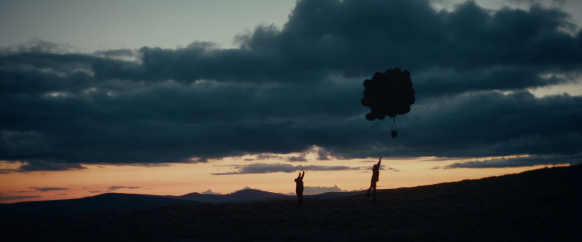
TOM & ROSS: As co-writer/directors, the filmmaking process really begins at the script stage for us, and we’re constantly discussing directorial ideas from the off. For this film, we were keen to really capture the vast, remote landscapes that these characters inhabit. We also wanted to visually communicate the estrangement and distance between our two leads. To achieve this we decided - along with our DP Narayan Van Maele - to shoot in cinemascope and to favour clean singles on our characters.
CHEAT: How did you choose and implement a colour palette for this film? What kind of conversations did you have about story, set design, costume, and photography?
TOM & ROSS: The story wrestles with both a nostalgic feeling of Ireland and the Irish landscape whilst also carrying a Storybook/Americana quality that we were keen to capture. We wanted the isolation of the two protagonists against this imposing rural backdrop to present in the texture and dynamics of the colour.
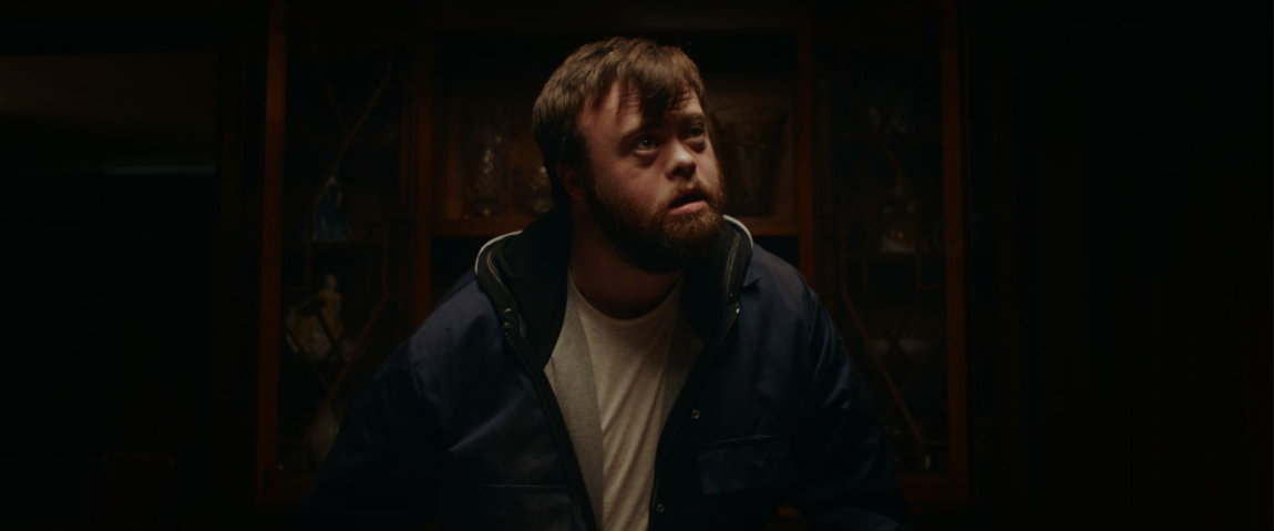
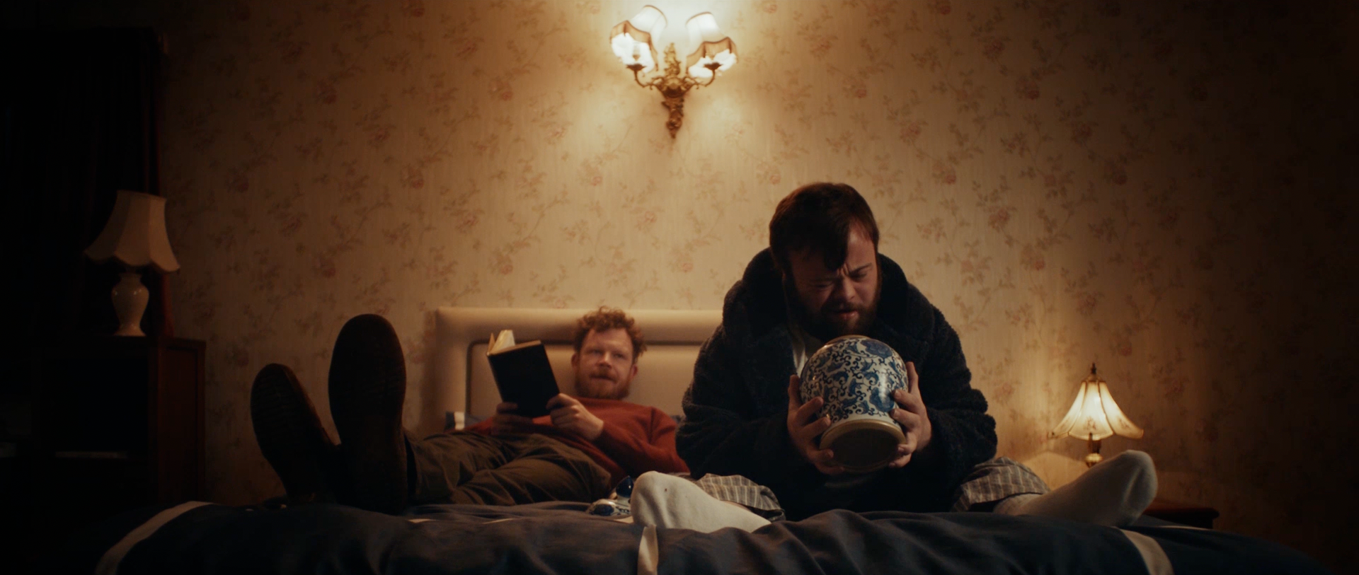
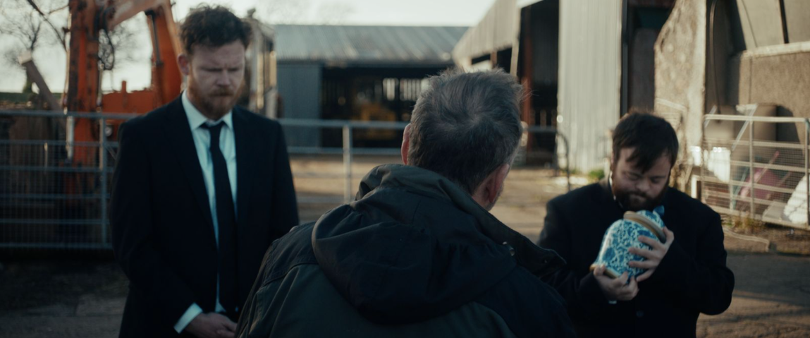
We built a colour palette largely around autumnal themes - those rich, earthy tones that give us a sense that the summer is behind us and that things are beginning to whither and die away. The boys wear a lot of forest greens, browns, burnt oranges throughout the film, and this palette is carried throughout the set design, too.
As we move through the narrative, those desaturated and more desperate looking vistas begin to warm up in line with the brother’s reconnection. By the end of the film there is a renewed sense of life and colour, leaving these characters in a completely different space than where we found them to begin with.
CHEAT: How do you think Jonny’s colour work helped shape the way the audience perceived, and will perceive, this film?
TOM & ROSS: Until you’ve watched a colourist at work, it’s easy as a layman to take the art of the job for granted. But seeing the way Jonny could elevate an image and bring out different elements really hammered home the importance of the job. Jonny helped us find a look that honoured our references and initial instincts while pushing them in new, exciting directions.
The subtle colour shifts that Jonny achieved really align with the narrative beats and create a mood that helps to capture the story visually.
CHEAT: Anything else you’d like to add?
TOM & ROSS: We were fans of Jonny’s work before we had a chance to work with him on our first film - hopefully audiences have appreciated how he has elevated An Irish Goodbye in the way that he has. And here’s hoping there’s a feature down the line we can collaborate on again.
CHEAT: At what stage did you get involved in the film? What brief were you given?
JONNY: Ross & Tom got in touch when they were in pre-production for the film. They sent through the script and then a moodboard with some beautiful references so we were fully aligned before they’d even started shooting. A real luxury especially for a short.
CHEAT: How would you describe the look of An Irish Goodbye, and how did you work with the directors and cinematographer to achieve this look?
JONNY: The film was beautifully shot by Narayan Van Maele. The Art Direction and Styling departments also did a wonderful job so the grade just needed to compliment what was already there. The references they’d sent me were all shot on film and had a beautiful richness to them. The grade is a film emulation look although not overly done. It’s a beautiful story with some wonderful elements of comedy and we set out for the grade to accompany this and not overpower it.
CHEAT: Are there any scenes in An Irish Goodbye that you found particularly rewarding or challenging? Why?
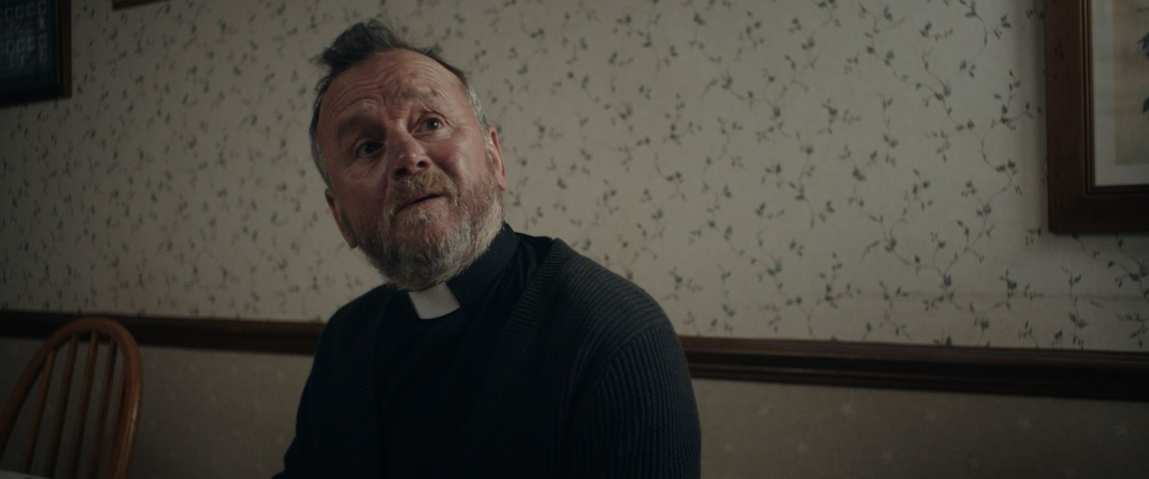
JONNY: To be fair the team did such a great job it was a joy to grade throughout. There’s a scene early on with Father O’Shea that I found hilarious so I enjoyed reviewing that one quite a few times!
CHEAT: How did you use colour to enhance the emotional weight of the scenes in this film - be it for humour or sadness?
JONNY: The opening of the film is a sombre one as the brothers are driving with their mothers ashes. The look here is much cooler, less saturated and slightly heavier. As they rekindle their bond the warmth and saturation starts to come through.
