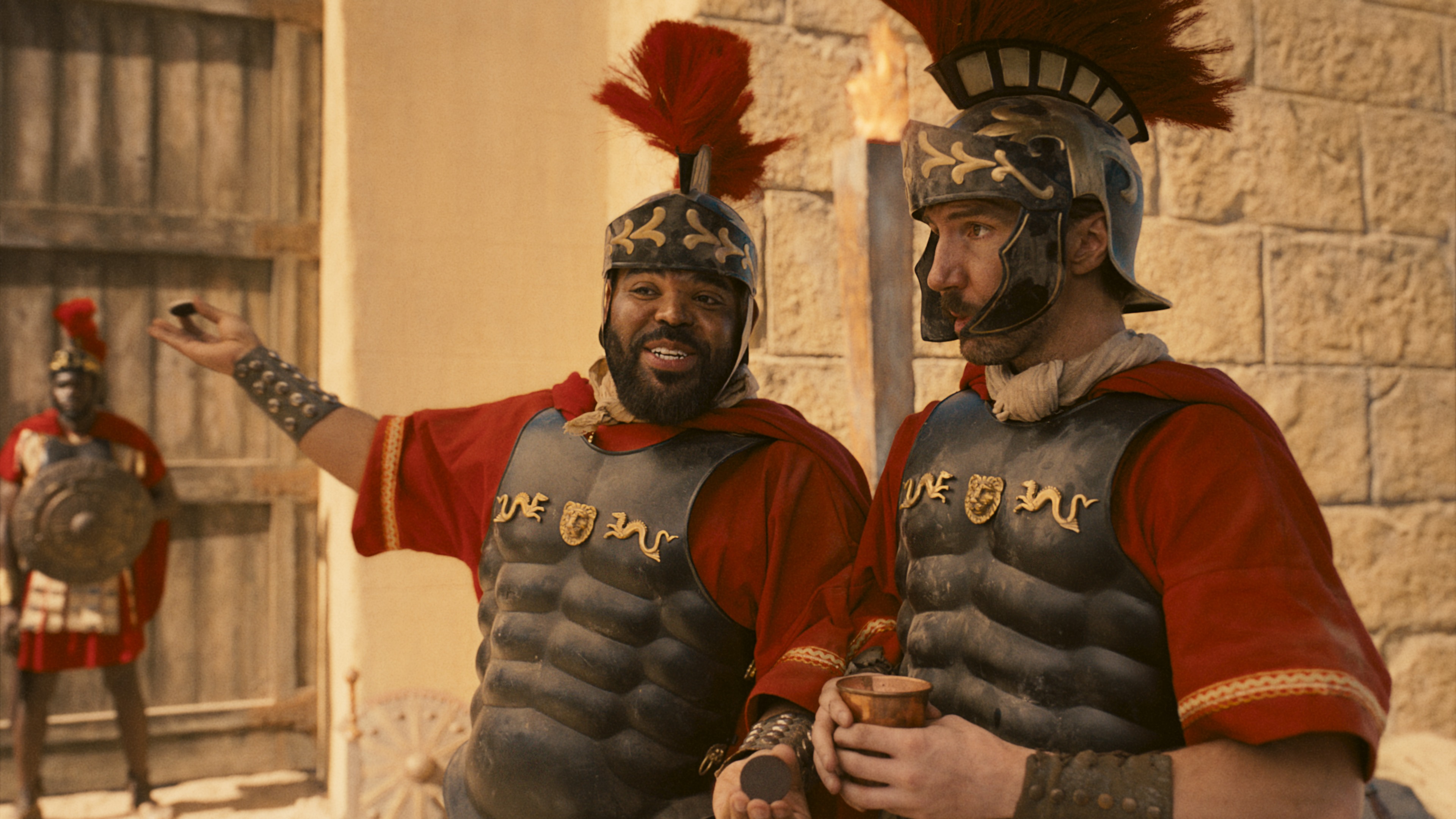
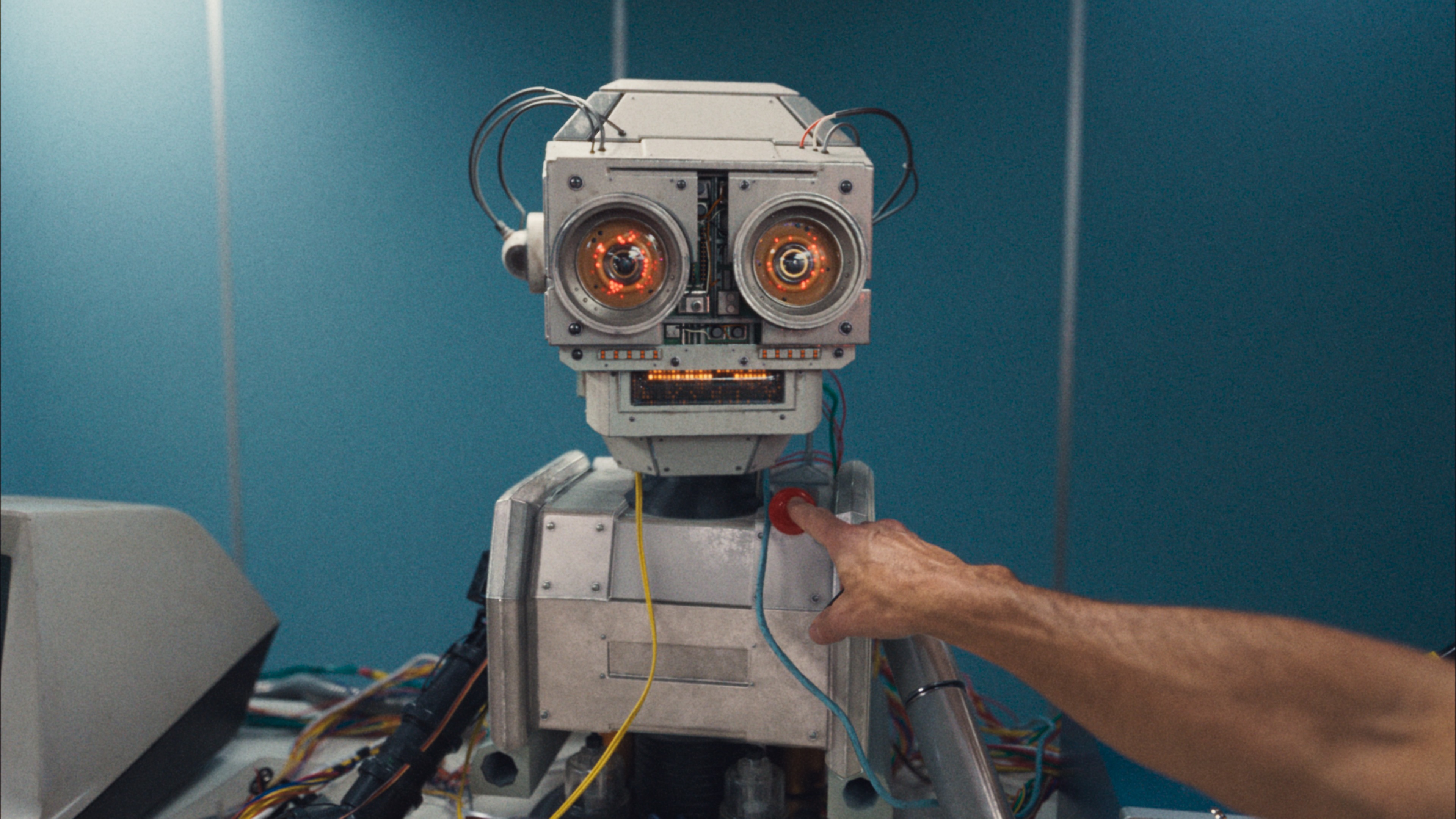
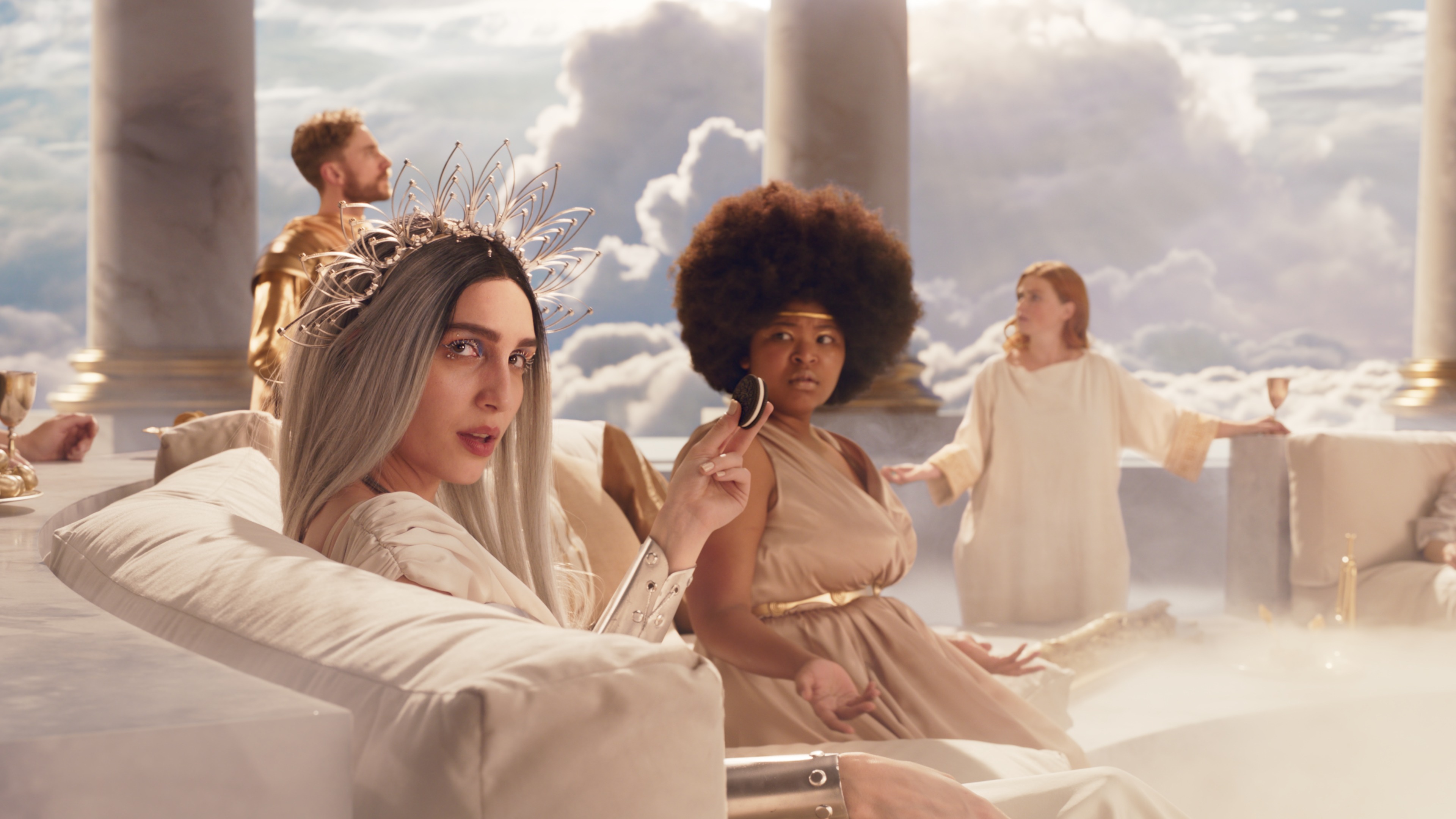
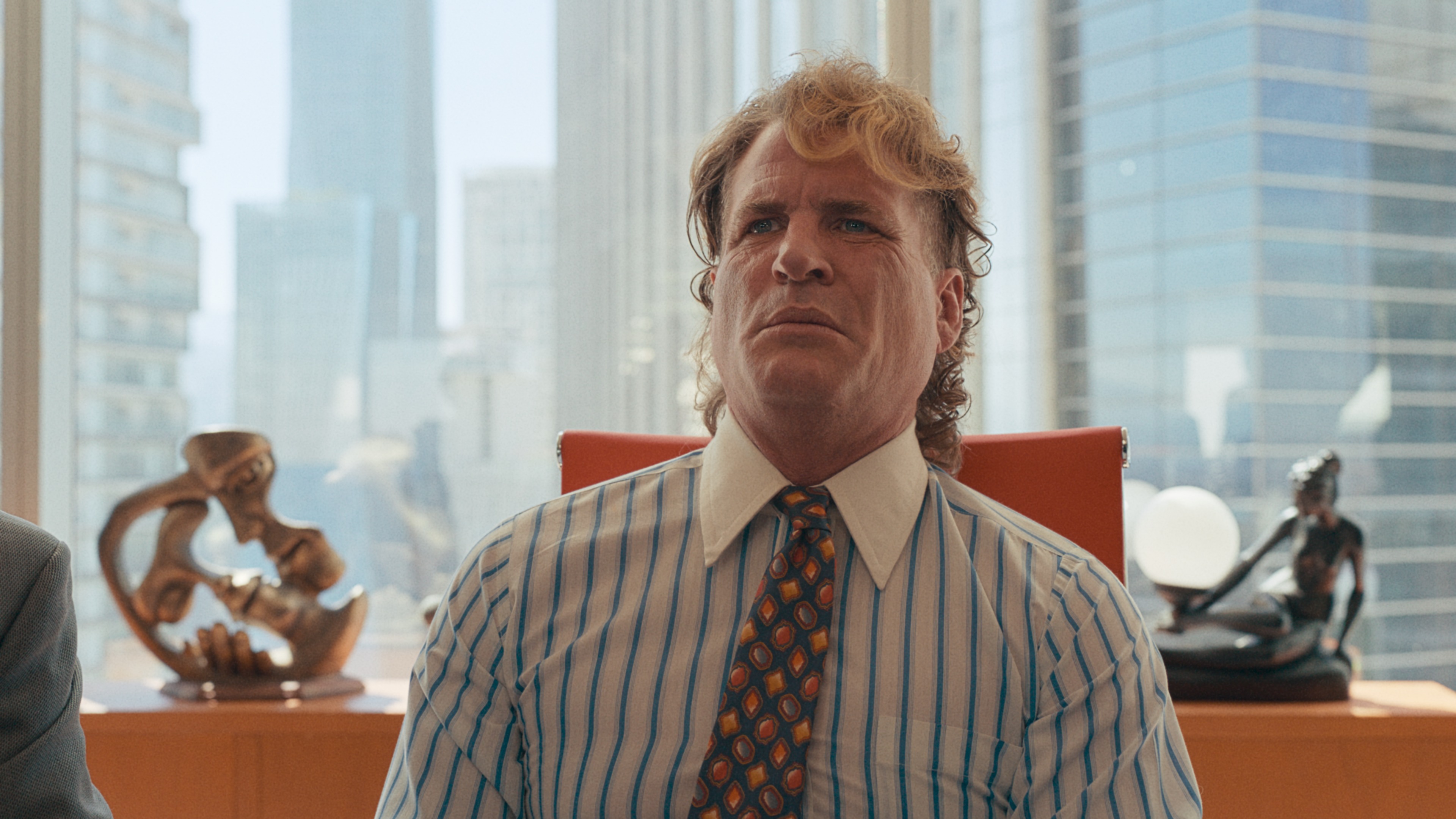
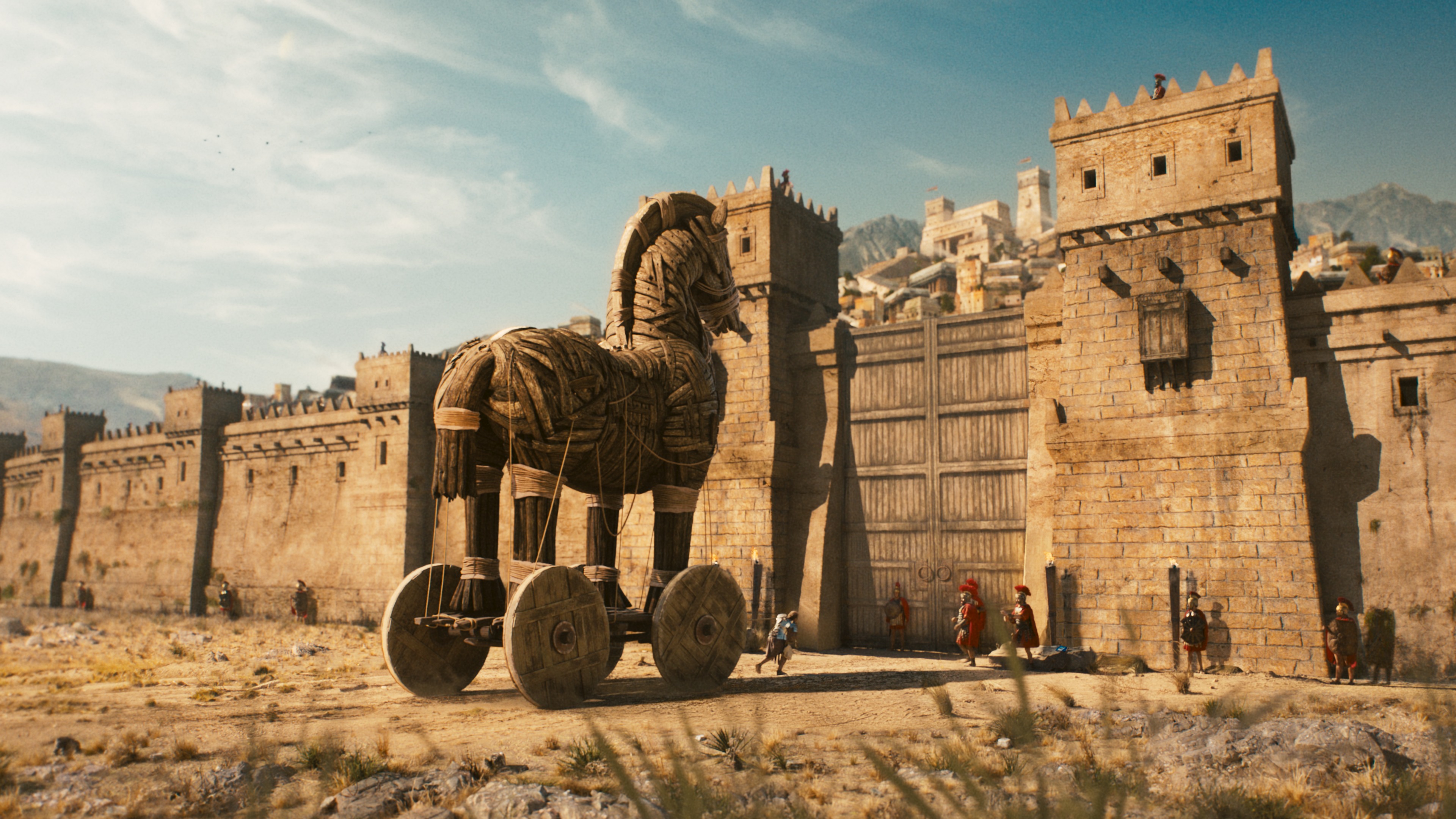
Ten years after their Super Bowl debut and subsequent ‘you can still dunk in the dark’ tweet went v i r a l, Oreo returned to the Super Bowl with ‘Twist On It’, an era-spanning depiction of huge historic moments that rested on the twist of an Oreo.
With Harbor, Karol was invited to colour the campaign, which consisted of a long version, a 30 second to air during the game, teasers and digital banners.
We spoke to Karol about the process, tools and challenges of perfecting a ‘Super Bowl epic’ look…

Karol, congratulations on your first Super Bowl commercial! How does it feel to have your work viewed by 100 million people across the world?
KC: Oh it’s massively exciting, and a really fun milestone! The scale of Super Bowl commercials, mixed with the passion, creativity and energy poured into this one from the whole team at Harbor makes it an especially proud moment.
At what stage did you get involved in the process, what was the brief, and what ideas did you bring to the table?
KC: My involvement began pre-shoot, mainly in the form of workflow meetings and the nailing down of logistics between London and NYC. Once the edit was it’s final stages, Dave, Jo, and I had some initial chats ahead of the grade, sharing references and breaking down what was and wasn’t working with the dailies look. This gave me a chance to squeeze some look dev time in before flying over.
The brief was to keep each of the time periods distinct and obvious, whilst maintaining flow and energy throughout the entire spot.
How did you work to differentiate the look between each world, while still achieving a cohesive look across the commercial?
KC: Once the creatives were in the room with me, I started our journey off by looking at the references I’d gathered beforehand for each specific era. Analysing these became the jumping off point of our own creative exploration as we played with the various building blocks for each (things like texture, tone, density, halation, etc.) to develop the essence of each look.
I was conscious to prioritise elements that would hold up well after compression, which often isn’t kind to grain. The ’90s boyband scene was a lot of fun and took some nuance to get right, giving a nod to old scanners with a heavy magenta cast.
The grade evolved a fair bit as the VFX came in, for instance the ’50s alien look that we initially set was too heavy handed once we saw the scene again with the spaceship. I always made sure to adapt things to make the most of the amazing worlds that Harbor’s Creative Director Kyle and his team were creating.
Can you tell us a bit about the collaborative workflow and color management integration with Harbor’s VFX team…
KC: We settled on working in ACES which provided a standardised and consistent foundation when sharing material between Resolve and Flame. The first colour session was pre-VFX, so it mainly acted as a test-grade / look setting session, due to some of the scenes being predominantly green screen at that stage (like the Gods scene). We then exported LUTs for each shot, which helped flame (and the clients) to better visualise how their work would look under an approximation of the look that we had set in colour.
Me being over in the Morton office meant that we all got to collaborate really closely. My suite was next door to (Creative Director) Kyle & (Lead Artist) Anne’s which made sharing and testing ideas a breeze.
Were there any particular features and functions that played a crucial role during this particular grade and can you tell us what and how?
KC: Group grades in Resolve were particularly useful for this project for allowing me to setting up the individual looks at the end of the colour pipeline, across multiple shots, doing a lot of the heavy lifting for the look. It also let me keep things tidy by doing all my matching and shapework on a shot by shot level.
What did the review process look like? And how was that facilitated?
KC: A combo of in person sessions with the creative team at Morton St. and remote grading on Clearview for pickups and changes. I also had the chance to sit in on VFX review sessions, which was really satisfying watching it evolve creatively.
Talk us through the key challenges & creative opportunities in the grade…
KC: The main challenge was making sure that the whole spot flowed nicely across the eras, we played with countless micro-versions of each scene before we found and dialled in the final looks. Striking a balance between creating strong looks, but not so much so that they draw attention to themselves and away from the joy of the commercial itself.
Creatively it was a treat to have access to mattes from flame to isolate almost any element that we needed in the grade, giving us maximum flexibility in the suite.
Were there any moments in the process that you wanted to twist on?
KC: Lol. As a foodie, twisting on what to each for lunch when I was over at Morton probably would’ve helped… New Yorkers have it good.