
Colourist Toby talks about the process, creating worlds, and working in HDR.
“The look development of Great Expectations began in preproduction with DOP Benedict Spence ,where we set the dailies look on screen tests with the actors in costume and on set. It’s always great to have test material that is indicative of the show and let’s us hone in something much more tailored to the show than using dull test room material or lens tests in a test room so I’m always grateful if we get to work with proper screen tests!
When Dan Atherton picked up block 1 and became the primary DOP he stuck with the original LUT for dailies to maintain consistency, but when we got together for finishing it was clear we needed to adapt the work we did earlier to work for the show and tell the story how Dan, Brady and the execs pictured it. This was also the first time we began working in HDR instead of SDR. We kept a lot of the film emulation elements from the original look, keeping a nice filmic roll-off but adding some additional texture to the highlights with the extended range in HDR. With the extra range in the highlights we found we could also go softer in the midtones while still having ‘bite’ in the image, so we altered the tone curve to create a slightly more painterly tone with a softer more muted palette throughout.
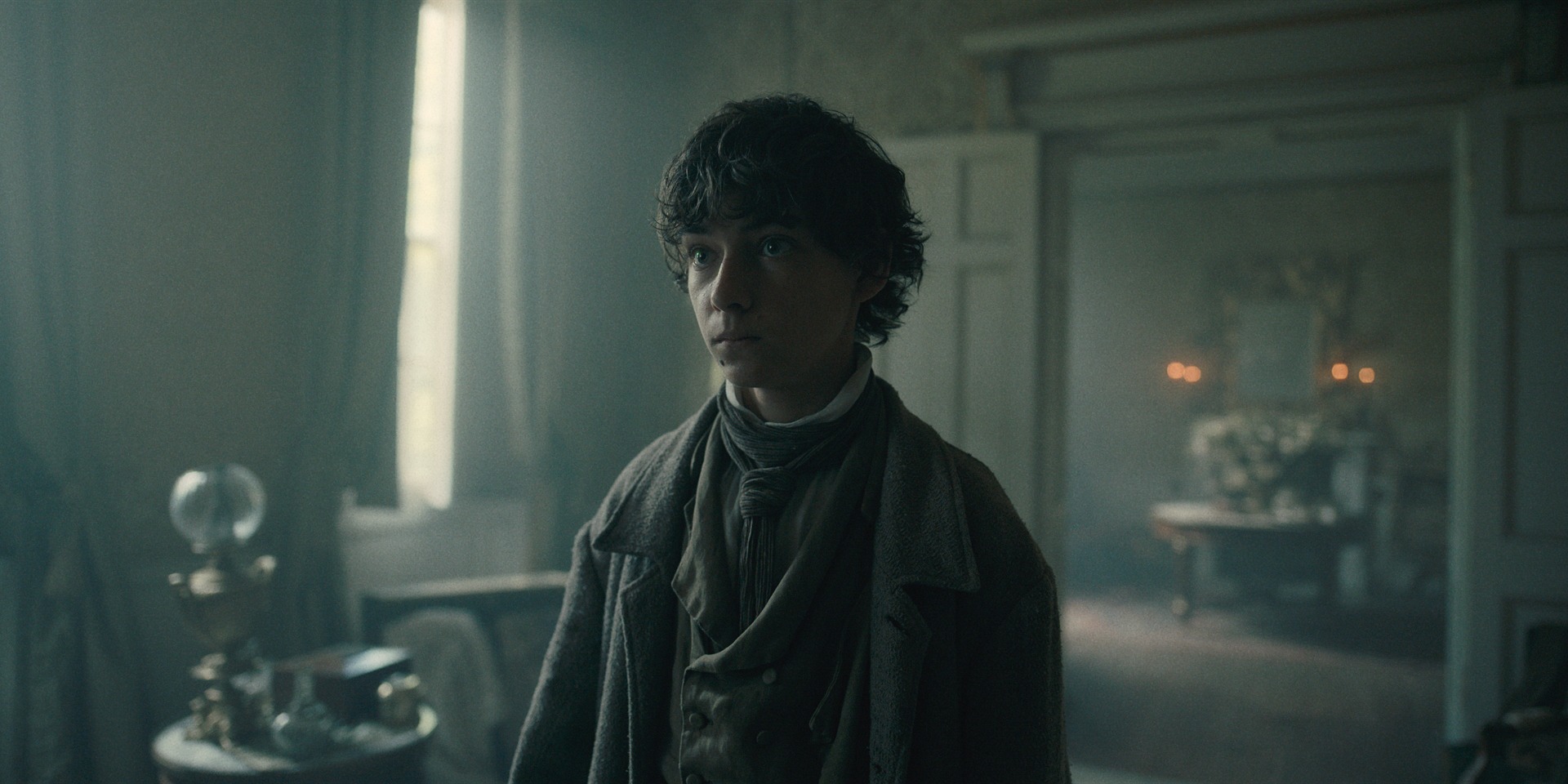
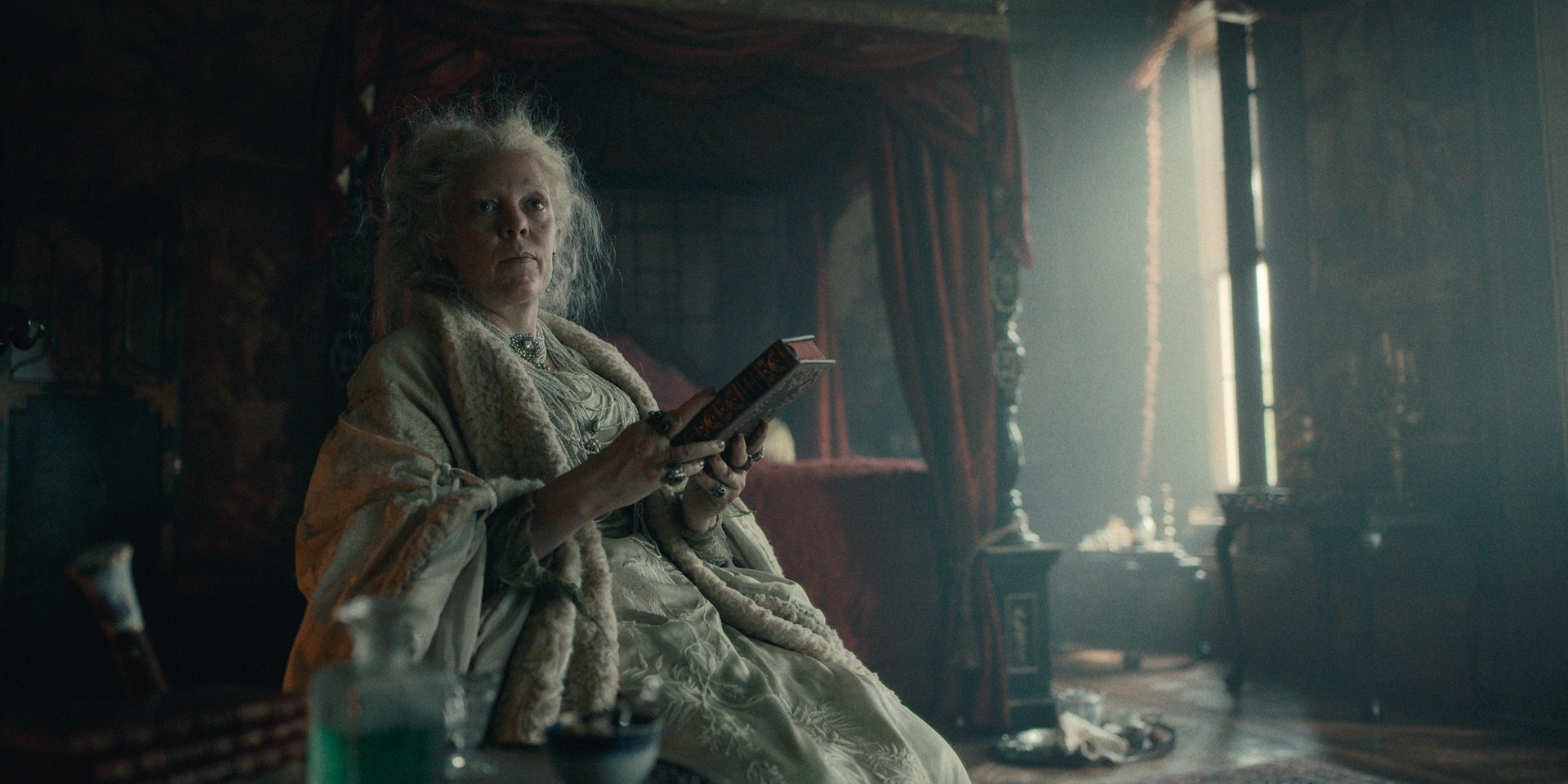
The execs really wanted to separate the different locations of the story, so we then separated the look into 4 ‘worlds’; ‘Home/Countryside’ which was used for when we were in Kent where Pip, Joe and Biddy live that hand warmer undertones with a more neutral look that allowed more greens and yellow to come through. ‘London’ which was used for all things London, a slightly harsher look with cool shadows and an overall push to a cyan blue. ‘Haversham’ which was used for all things Mrs Haversham, which was smokey with an opium green tint and hazy highlights. There was also a ‘Candlelight’ look that we used for when Candlelight was the dominant light source as we needed to tailor the look for such warm sources and make sure the firelight looked real without making the skin tones overly orange or red.
It was Dan’s first HDR grade and it was a real pleasure to go on that journey with him and show him how we can keep things nice and filmic while also taking advantage of the extended range available. I think there’s a lot of misconception out there about HDR and Dan was always keen to explore and learn what’s possible while staying true to his taste and his eye as he adapted to HDR with his own work. I was nervous at first when we started deviating from the original look but I’m so glad we did because we found something that really works for the story and has a unique look to it that straddles a more classical period film look with some contemporary flair. I hope everyone else sees it the same way. Please watch this in HDR!”
DP Dan commented to British Cinematographer:
Toby is a real talent and has an eye for adding filmic texture. I’m really happy with the end result because at times it did feel too digital with the dailies, but I tried to dirty it up with lighting, but in post it really made the grittiness come to life – and that’s down to Toby.
It was such a wonderful experience. Initially I was nervous because the primary grade had to be in HDR, then an SDR trim would happen afterwards. I knew we’d be opting for a kind of filmic print look and that is very traditionally SDR. What was making me nervous was if it was possible to achieve a film look in HDR, and I didn’t know that we could do that until working with Toby. We were not working in the 4,000 nit range – now that’s the difference. Instead, we operated with the highlights only 1-2½ stops over the normal SDR range so our white point was only a few stops higher. But having that more texture in the highlights allowed us to have smokier mid-tones and softer shadows, but still maintain that depth of the image. HDR can be such a trap, because you can stretch out the waveform too far and it feels too big and digital, whilst I feel we got the right balance of having a slightly bigger waveform but having a very painterly canvas still.
Great Expectations is available to watch now on the BBC.
See more from Toby here.
*All images courtesy of the BBC.*

