
What’s your process when developing a look?
Look development is such an important collaborative part of the process for me. I like to have lots of discussions, gather many visual references, and go through it together before we start experimenting in the suite. I think it’s important to take the time here before moving on to scene or shot specific discussions so I try to spend as much time on the look development of the overall look to define the world we’ll be in for the whole piece; something that is flexible for each scene but unifies everything with a distinct creative intent that is natural but creates the right ‘universe’ for the whole piece. It’s a very non-linear process of moving between the overall look and individual scenes/shot, finding out what should be part of the overall look and what should be scene-specific. Sometimes the overall look is refined after we finish the original look development as we will discover things in one scene that may work across the board. I love this part of the process.
Is there a creative project that stands out as being important for you, or that changed your career?
‘The End of The F***ing World’ is a special one for me. I’ve worked with Jon (dir) and Justin (DoP) since the start of my career and we worked on the pilot 6 years before the series so it was a long journey that culminated in a great success story. Something about it just clicked and lots of people loved the look so it certainly advanced my career. It’s always nice to work with people over time, especially if your taste is similar, you develop a bit of a shorthand and the work just flows. Jon and Justin are both incredibly talented with strong visions but there’s also collaboration involved in the grade, so it’s nice to have that as a colourist. I think it’s in the interpretation of another’s vision where colourists express their artistry.
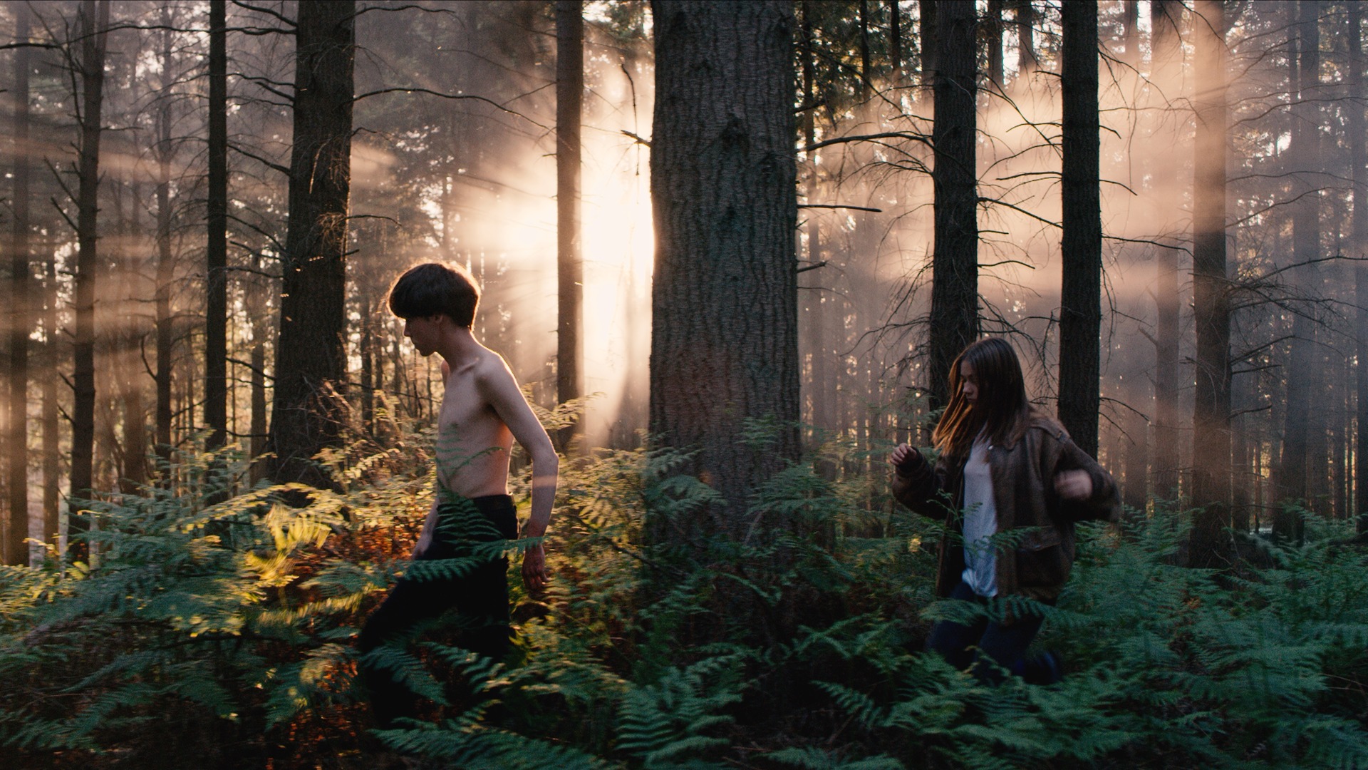
[Above: Image from ‘The End of the F***ing World’ Series 1]
What challenge(s) do you come up against most in your grades, and how do you find a solution?
Colour is really subjective, so if there are multiple people involved it’s easy to get caught in the middle of opinion and end up compromising each other’s ideals to find a happy medium. For me, the real fun is trying to create something that everyone truly loves. As colour and emotion can be hard to express, language is often a barrier, so sometimes a comment like ‘it feels a bit too moody or too dark’ doesn’t necessarily mean the image needs to be brighter. Sometimes added colour or contrast can achieve the right response in feeling. As a colourist, it’s my job to investigate the feeling from within the comment and interpret that to make a change that fulfils the deeper issue, rather than reaching for the brightness knob, for example.
What’s your favourite part of a project?
My favourite part is look development and crafting the overall look or ‘universe’ for the piece. Back in the film days, a director and DOP would choose a print stock for the film/show and that would be used for the whole thing. Then we had LUTs to go from the camera raw to a display space (say Rec.709) and people grading below that. Now we have a whole plethora of tools to better prepare the images for display, creating whatever look or feel we want in much less destructive ways than before. I like being a human print stock haha! For me it’s integral to create an overall look that ties everything together and elevates the intent of the filmmakers throughout.
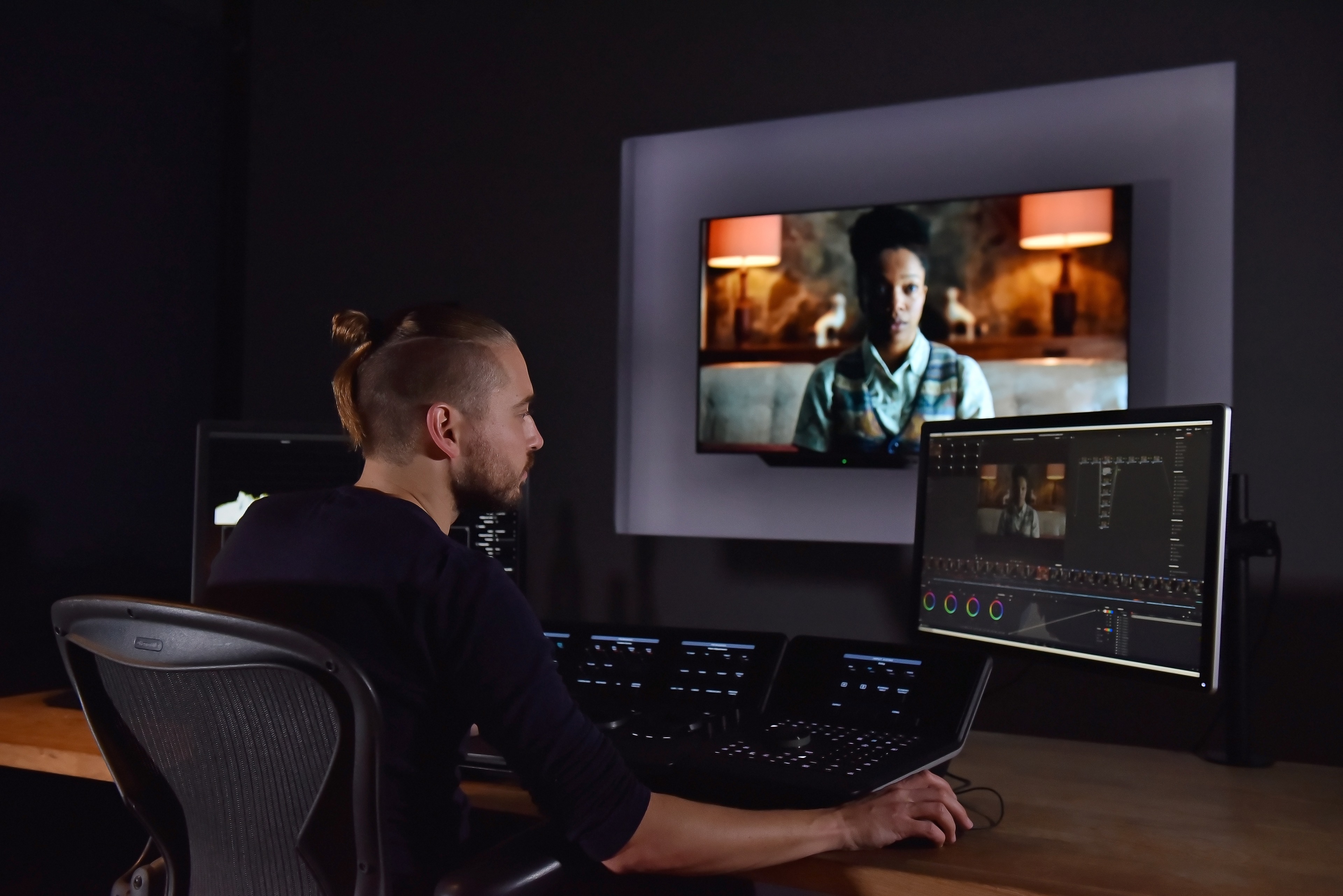
[Above: Toby in the suite grading ‘The End of the F***ing World’ Series 2]
How do you use your craft to enhance story, emotion, and ultimately drive effectiveness for brands?
It’s really all about feeling. Although colour is subjective there are certain techniques to elevate certain feelings. The simplest examples are desaturated cool tones for sadness and warm bright colourful tones for happiness. But there are also more nuanced changes in colour that can help make something feel more like a memory of reality. These subtle changes can engage the part of the viewer’s brain to see the images on screen as a story playing out on a canvas, much like when people watch a film. Reality and ’true’ colours can look like documentary or factual television and actually take the viewer out of the imagined reality and back into the real world. This might lessen the impact of the story and emotion. Authenticity and reality, for me, are very separate things. I think moving image was so ingrained in celluloid (film) that entire generations of people are so used to seeing stories unfold on screen in that way. It’s very far from how the true colours really were on those films, compared to more ‘real’ renditions of colour in factual entertainment or documentary. So, if we can tap into those neurological triggers in advertising we can take advantage of the subconscious relationship between image and feeling, which is a powerful tool to help create emotion and deliver impact.
What do you think is the greatest use of colour example in any moving image? and why do you think it’s so effective?
The use of colour in ‘Hero’ is one of my all time favourites. Each character is given a colour, which is established early on and then played with later to introduce characters before they appear on screen, and so on. It’s so powerful because the colour use is established so early on that it can be used meaningfully later on to great effect. I think colour theory in general can often try to find meaning in colour that is too generalised and without context. The beautiful thing about moving image is that we have the dimension of time to play with, and how we see colour is so heavily influenced by context, what came before, what comes after, and what surrounds the colours themselves in the image. I don’t think there are any rules that can’t be broken when it comes to general colour theory and what we do with moving image, and that really excites me. There are too many variables to have hard and fast rules when it comes to the use of colour, but when it works it really elevates the feeling of something and makes it much more effective at touching an audience.
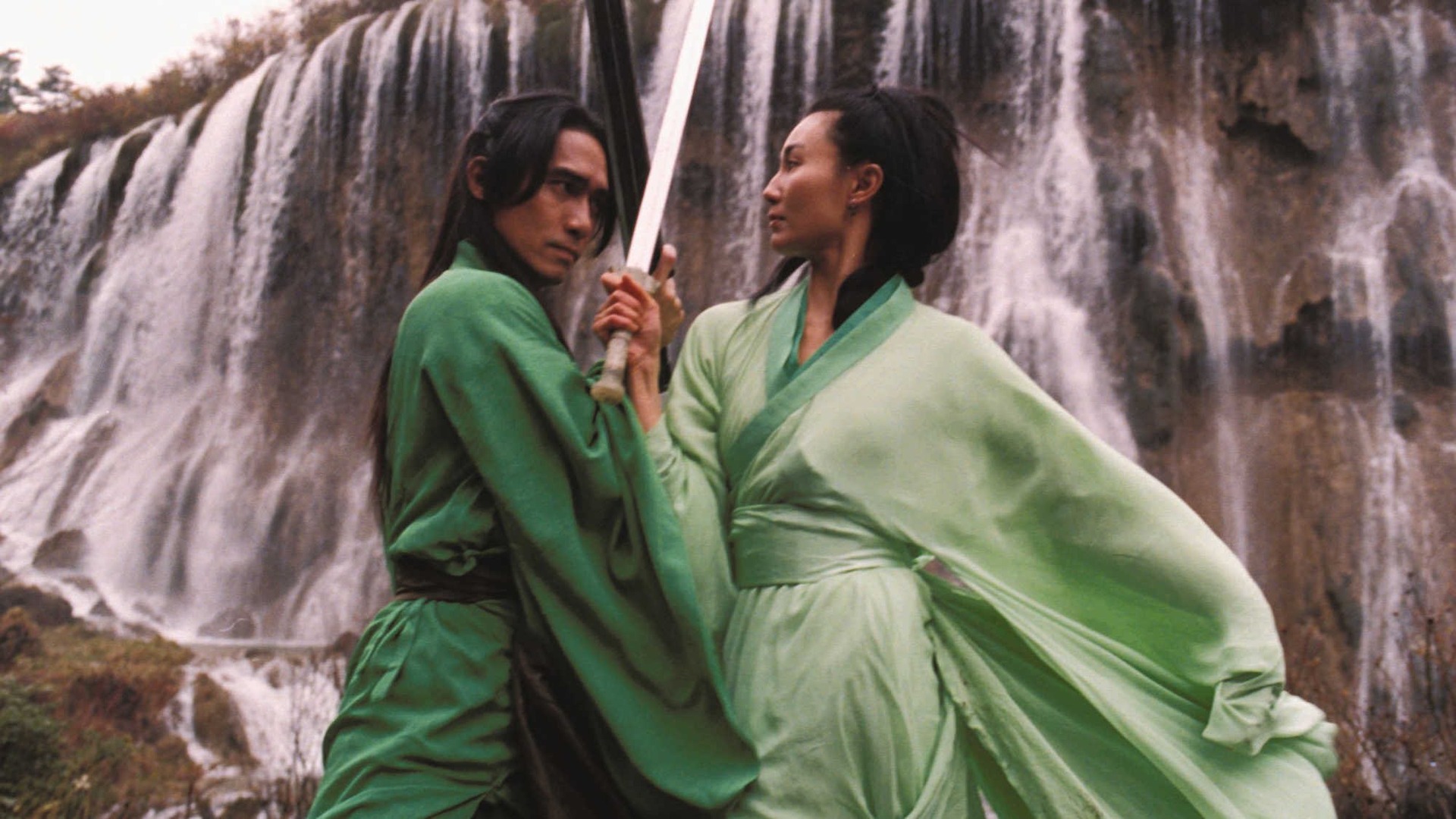
[Above: Image from Zhang Yimou’s ‘Hero’ (2002)]
A lot has changed in the industry over recent years. Which changes have affected your craft for the better?
My favourite part of the job is collaboration so it’s great in recent years it’s become a lot easier to work with people remotely. We can now connect someone anywhere in the world to an accurate live stream of what I’m seeing in the suite, and although their viewing conditions might not be ideal (I’m looking at you, Creative with a window behind you on the Zoom call!) it lets us work together in an interactive way and make the prices much more efficient and enjoyable.
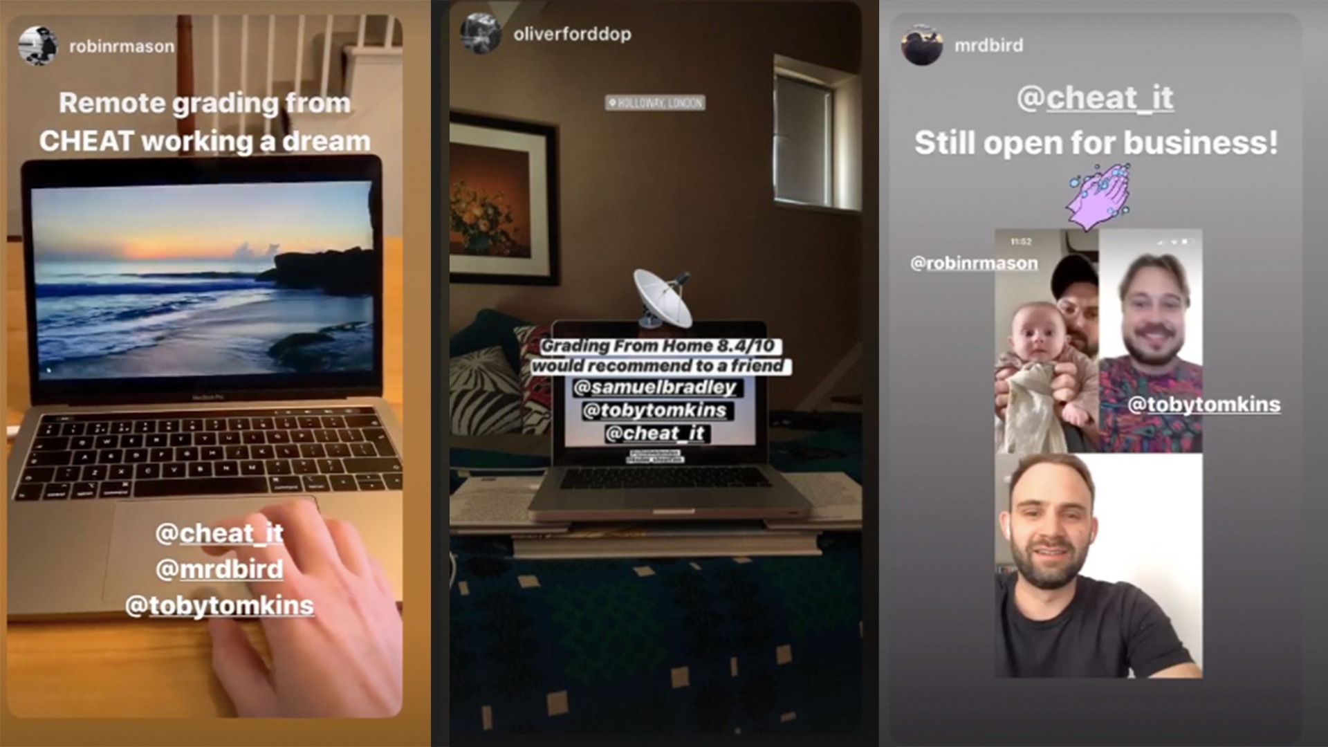
[Above: Instagram stories from collaborators working remotely]
What new tools in grading are helping you on a daily basis, if any?
The new scene referred grading tools in Resolve have transformed how I grade. It gives me control over things like exposure, temperature and tint that are much more photorealistic and lets me match images much more naturally and quicker. It’s like going in a time machine and adjusting these elements on set. It’s a game changer.

