Proven link between colour and emotion in advertising detailed in new book ‘Look Out’
‘Look Out’, by critically acclaimed author Orlando Wood, is an exploration of how to make great, vivid, human work in a world that’s turning dangerously inward.
Published by the IPA as a tool for advertising professionals, it details key insights around audience attention, brand-building, campaign effectiveness and the impact of technology.

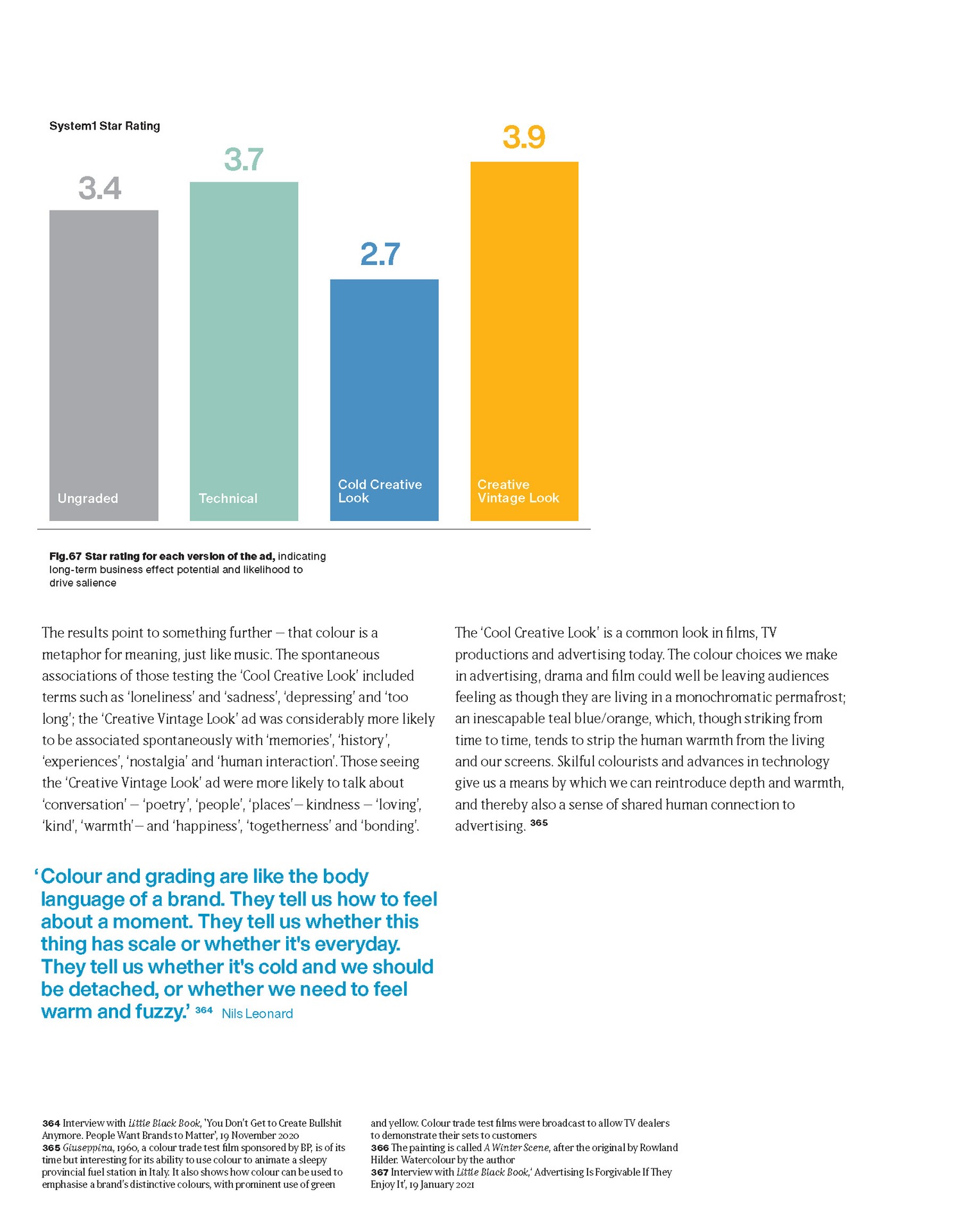
Toby collaborated with Orlando to explore the impact colour, grain and diffusion has on the emotional response to both TV and online video advertising.
Using VCCP’s ‘The Originals’ for Cadbury and Age UK, they tested four contrasting versions of the grade to find the results show something Toby has long been working to prove: That colour is a metaphor for meaning, depth and warmth help create a sense of human connection, and ultimately drive salience and effectiveness.
Read more below.
In an interview from the ‘Emotion in Advertising’ series we partnered with LBB on, Uncommon’s Nils Leonard said:
“Colour and grading are like the body language of a brand. They tell us how to feel about a moment. They tell us whether this thing has scale or whether it’s everyday. They tell us whether it’s cold and we should be detached, or whether we need to feel warm and fuzzy.” - Nils Leonard
Find out more about ‘Look Out’ here.